 「CSS」Flex伸缩布局
本文站在一个会点 PS 的开发者角度去理解 Flex,并非前端开发者。
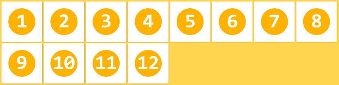
<div>
    <span>1</span>
    <span>2</span>
    <span>3</span>
</div>
在需要布局的元素的父节点,CSS 声明为 display: flex;
# 父类属性
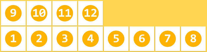
# flex-direction(排列方向)
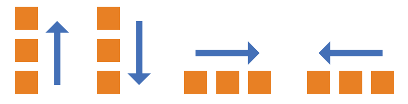
图中分别为: column-reverse 、 column 、 row 、 row-reverse
.box {
  flex-direction: row | row-reverse | column | column-reverse;
}
- row(默认值):主轴为水平方向,起点在左端。
- row-reverse:主轴为水平方向,起点在右端。
- column:主轴为垂直方向,起点在上沿。
- column-reverse:主轴为垂直方向,起点在下沿。
# flex-wrap(是否换行)
如果不换行,当子元素总宽度大于父宽度时,会压缩子元素宽度从而实现塞得下一行。
.box{
  flex-wrap: nowrap | wrap | wrap-reverse;
}
# nowrap(默认)
不换行。
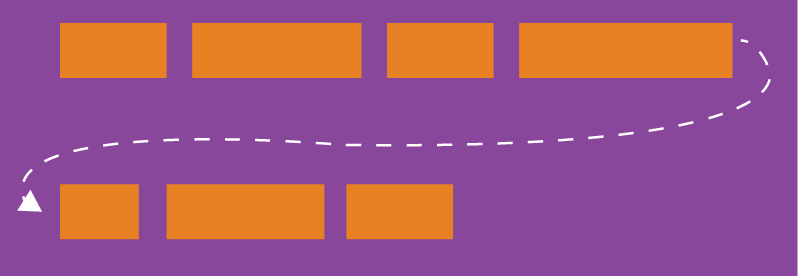
# wrap
换行,第一行在上方
# wrap-reverse
换行,第一行在下方。
# flex-flow(= flex-direction + flex-wrap )
lex-flow 属性是 flex-direction 属性和 flex-wrap 属性的简写形式,默认值为 row nowrap 。
.box {
  flex-flow: <flex-direction> <flex-wrap>;
}
# justify-content(主轴对齐方式)
.box {
  justify-content: flex-start | flex-end | center | space-between | space-around;
}
# flex-start(默认)
左对齐
准确来说应该是以开始对齐,根据
flex-direction(排列方向)起点对齐

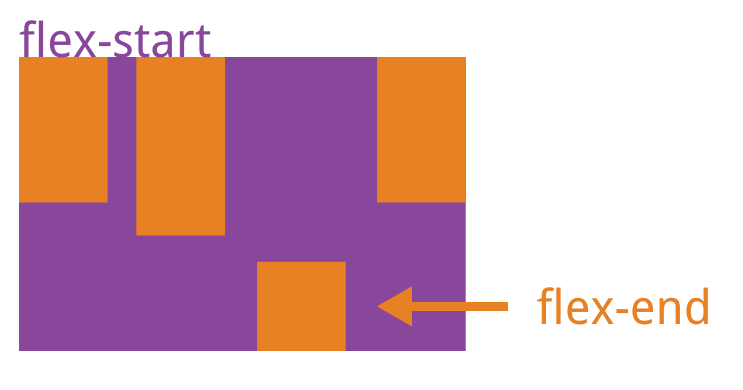
# flex-end
右对齐

# center
居中

# space-between
两端对齐,元素之间的间隔都相等

# space-around
相同边距对齐,每个元素两侧的间隔相等。所以,元素之间的间隔比元素与边框的间隔大一倍。

# align-items(单行侧轴对齐方式)
.box {
  align-items: flex-start | flex-end | center | baseline | stretch;
}
与
justify-content相同的值略
# flex-start
交叉轴的起点对齐。

# flex-end
交叉轴的终点对齐。

# center
交叉轴的中点对齐。

# baseline
项目的第一行文字的基线对齐。
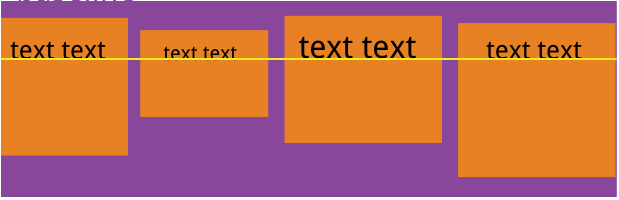
# stretch(默认值)
如果项目未设置高度或设为 auto,将占满整个容器的高度。

# align-content(多行侧轴对齐方式)
如果项目只有一根轴线,该属性不起作用。
.box {
  align-content: flex-start | flex-end | center | space-between | space-around | stretch;
}
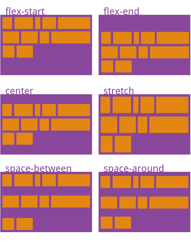
- flex-start:与交叉轴的起点对齐。
- flex-end:与交叉轴的终点对齐。
- center:与交叉轴的中点对齐。
- space-between:与交叉轴两端对齐,轴线之间的间隔平均分布。
- space-around:每根轴线两侧的间隔都相等。所以,轴线之间的间隔比轴线与边框的间隔大一倍。
- stretch(默认值):轴线占满整个交叉轴(高度拉伸)。
# 子类属性
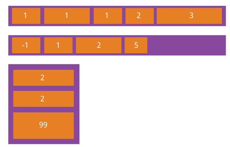
# flex(占比)
剩余空间分配宽度
没有声明此属性的子元素,不参与占比计算,因此可使用此属性实现部分子元素自适应宽 (高) 的功能
.item {
  flex: none | [ <'flex-grow'> <'flex-shrink'>? || <'flex-basis'> ]
}
延伸:实现左右元素固定宽度,中间元素自适应的效果

- 左右两侧的元素声明宽度,中间元素声明
flex:1
# align-self(单独侧轴对齐方式)
可覆盖 f 父元素的 align-items 属性
.item {
  align-self: auto | flex-start | flex-end | center | baseline | stretch;
}
# order(排序)
order 属性定义项目的排列顺序。数值越小,排列越靠前,默认为 0。
.item {
  order: <integer>;
}
# 参考资料
- 菜鸟教程. Flex 布局语法教程 [EB/OL]. [2022 年 6 月 11 日]. https://www.runoob.com/w3cnote/flex-grammar.html.
- 黑马前端。黑马程序员 pink 老师前端入门教程,零基础必看的 h5 (html5)+css3 + 移动端前端视频教程 [EB/OL]. [2022 年 6 月 11 日]. https://www.bilibili.com/video/BV14J4114768.
上次更新: 2024/03/11, 22:37:05